TV Branding: A broadcast package
Ramadan TV Broadcast Package
Arabic TV Branding: A broadcast package proposal
–
OVERVIEW
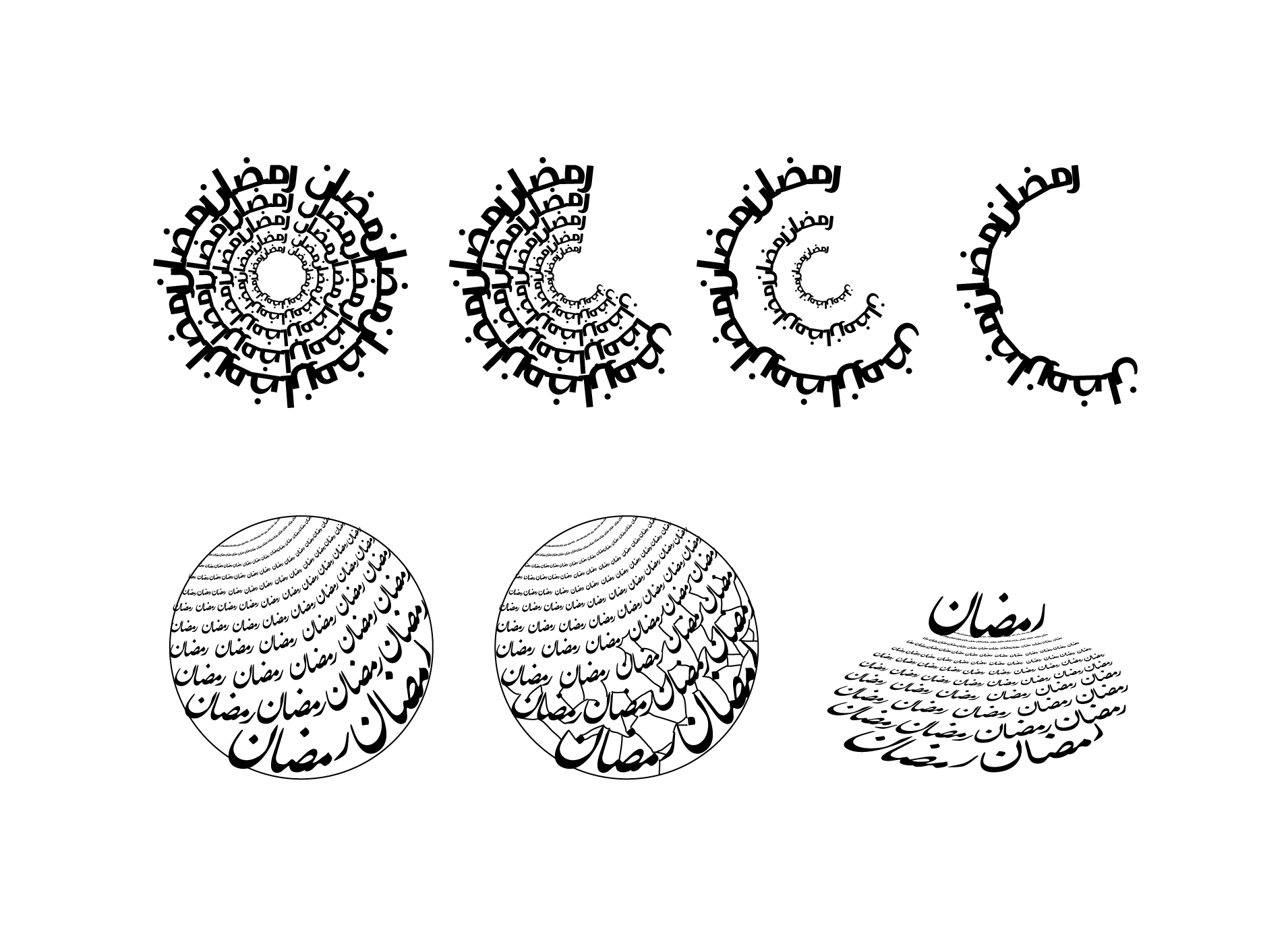
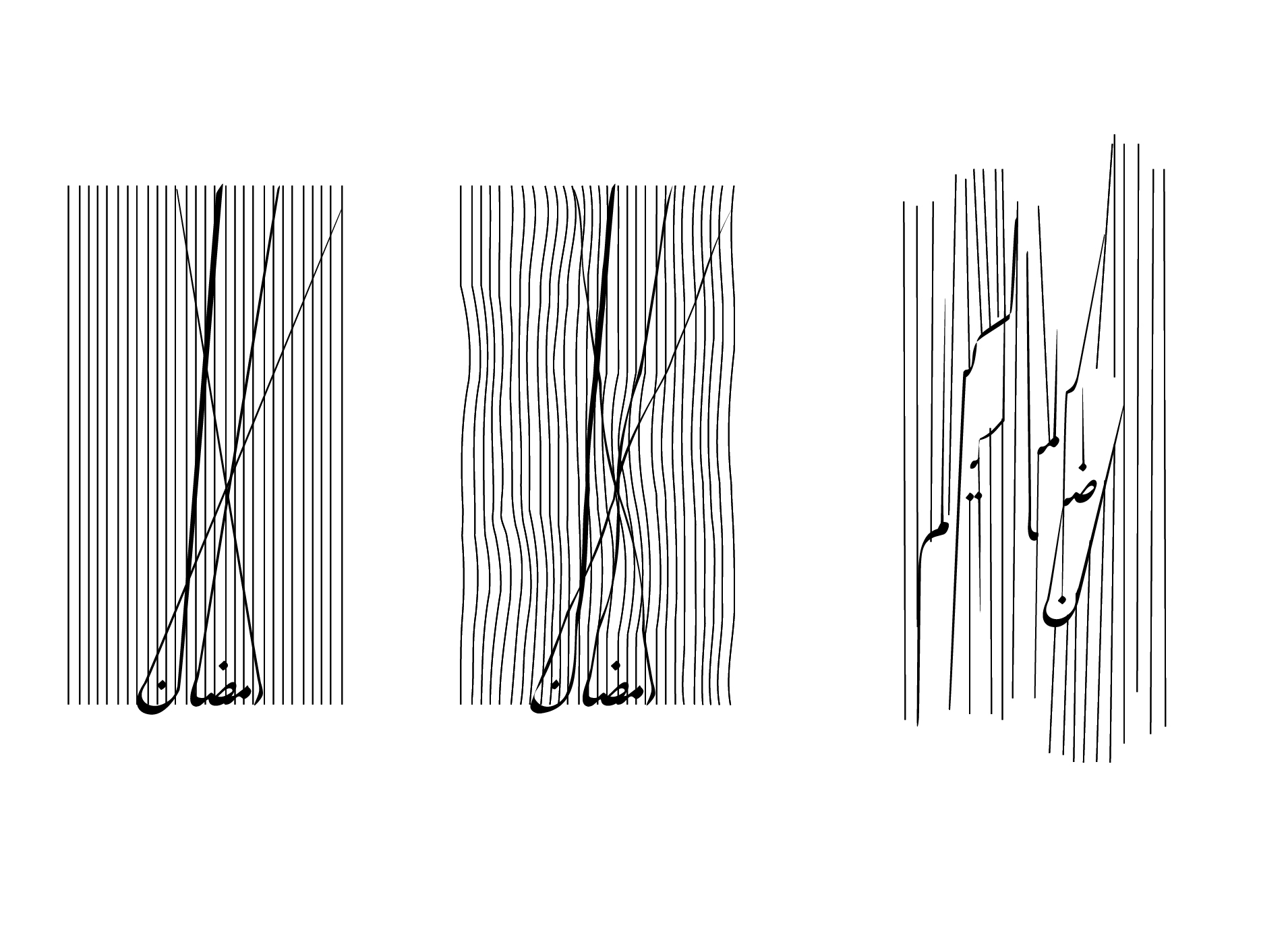
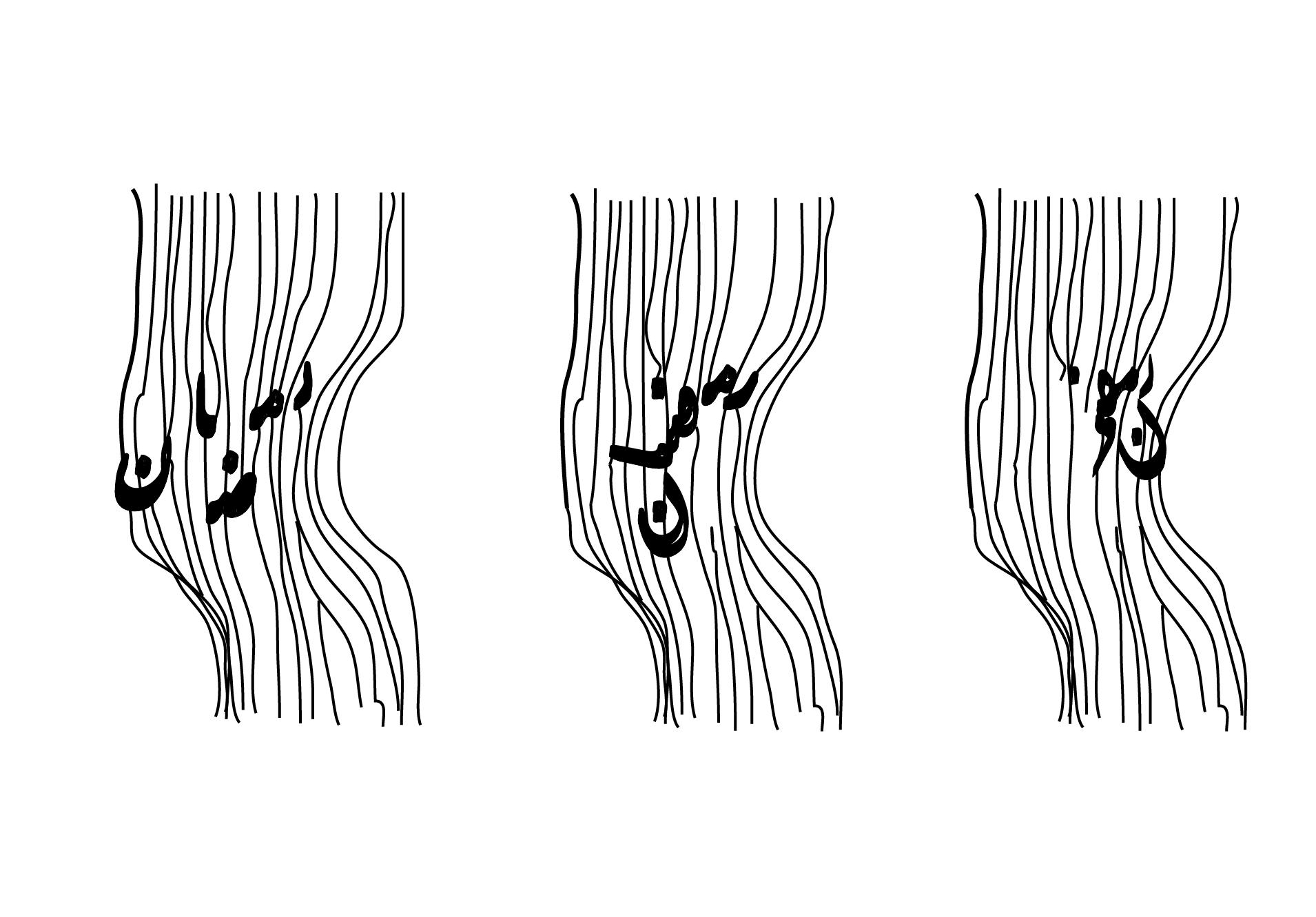
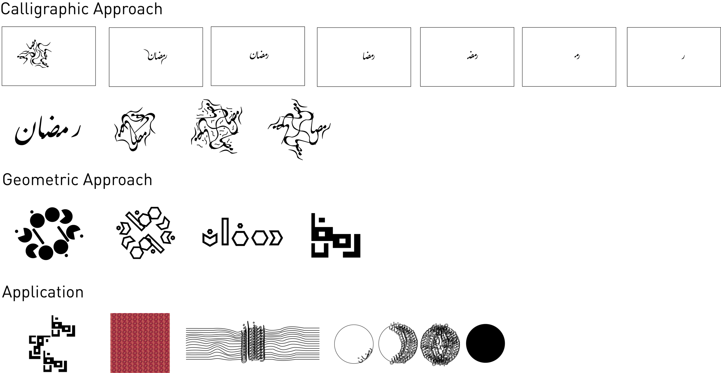
Branding an Arabic TV channel comes with a set of challenges that are reflected in the holidays' TV graphics, especially that of Ramadan. Unlike Latin, Arabic should be approached from a different angle, so blindly adopting the motion graphics and techniques that the West use results in a restrained outcome that does not evoke innovative creativity and is thus applied across all channels. The set of identity markers of the holiday is apparent whereby graphics share similar colors, icons, typography etc. Drawing on the traditions of the holiday and the kinetic typographic capabilities of Arabic fonts, I explored alternative approaches to the visual representation of Ramadan, while considering the limitations of an existing TV Channel's Brand: LBC.
ROLE: Solo graphic designer
purpose: bfa graphic design thesis
PROJECT LENGTH: 9 months
SERVICES: DESIGN RESEARCH, BRANDINg, motion design
–
THE SOLUTION
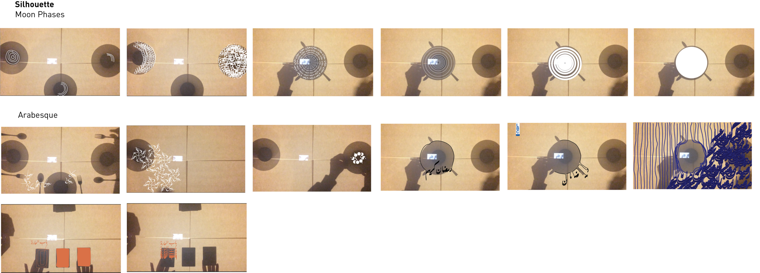
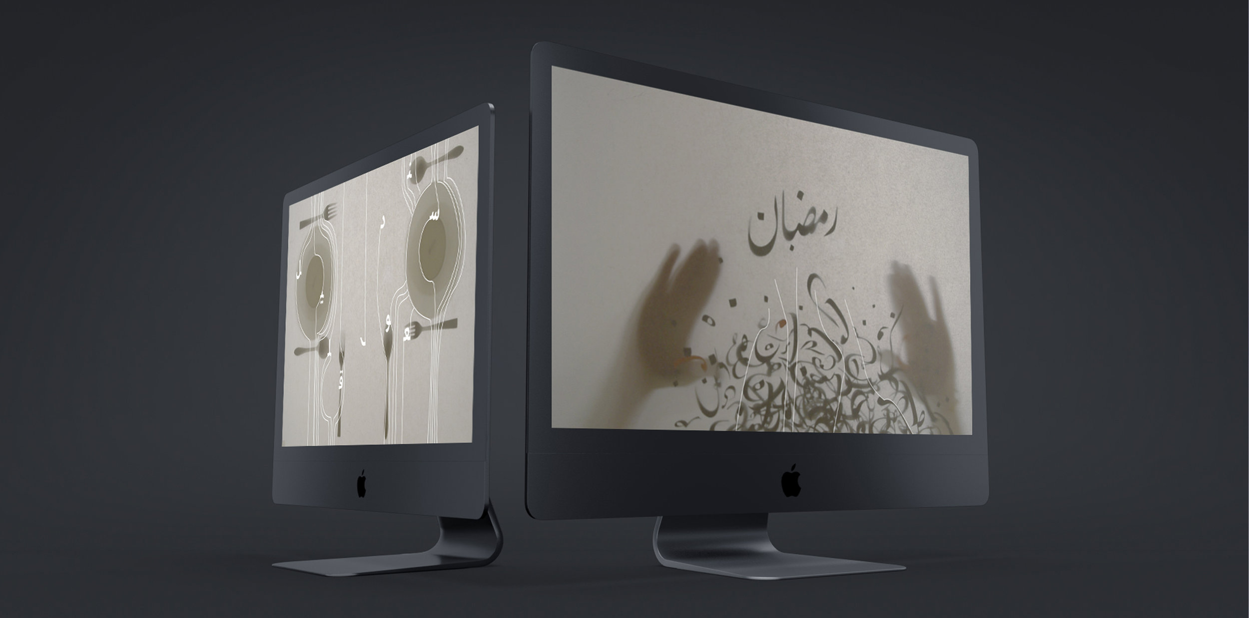
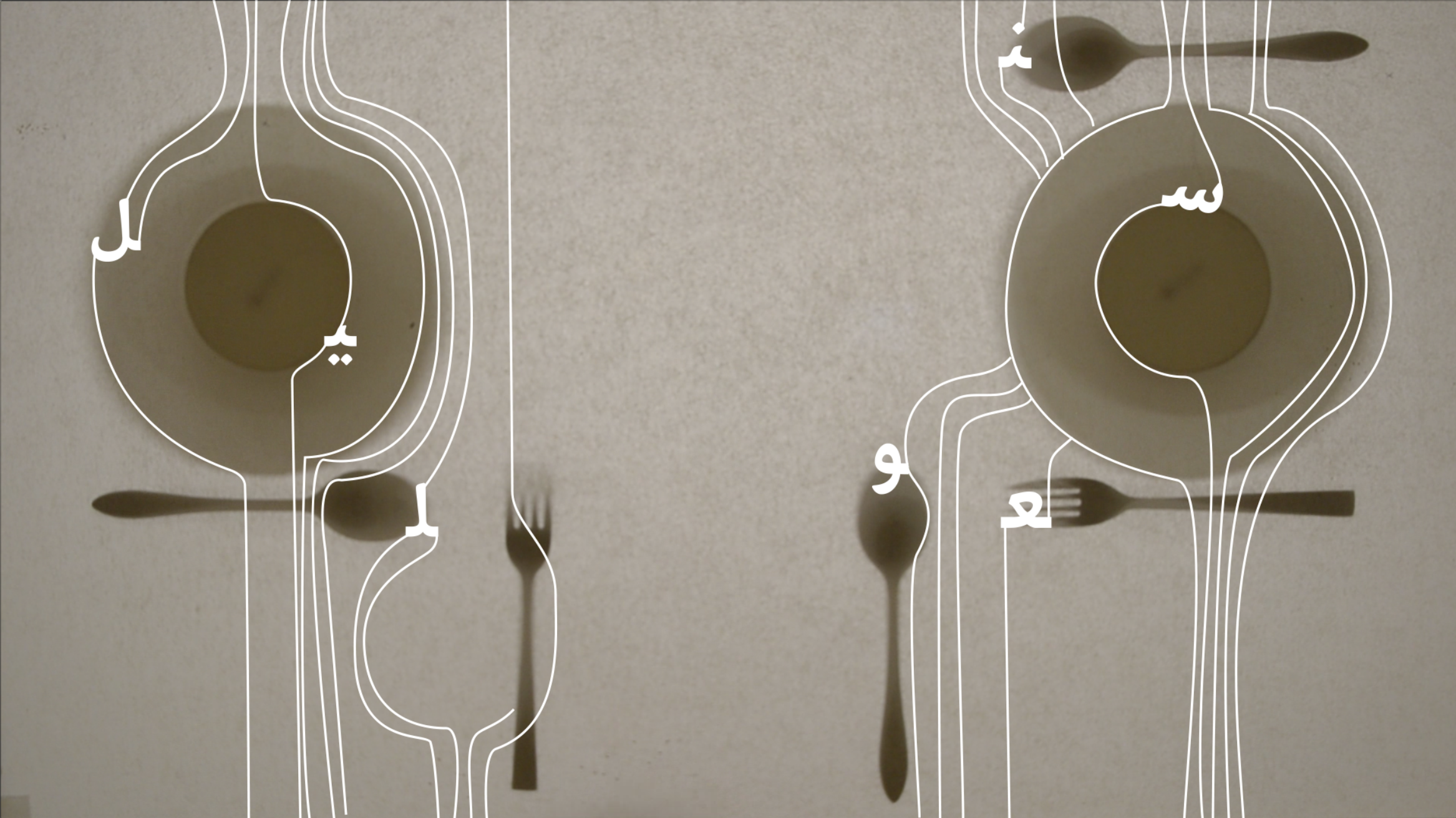
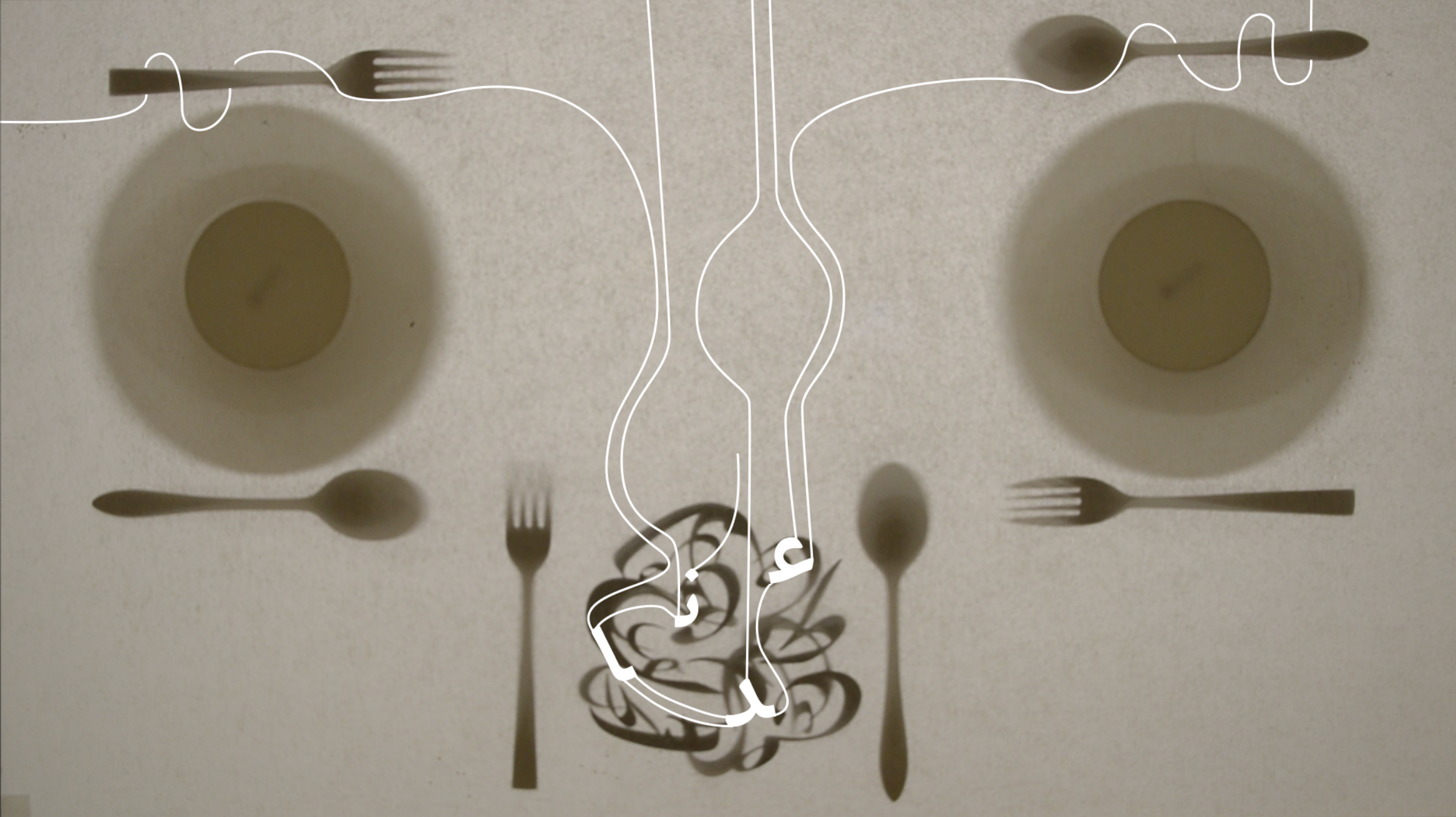
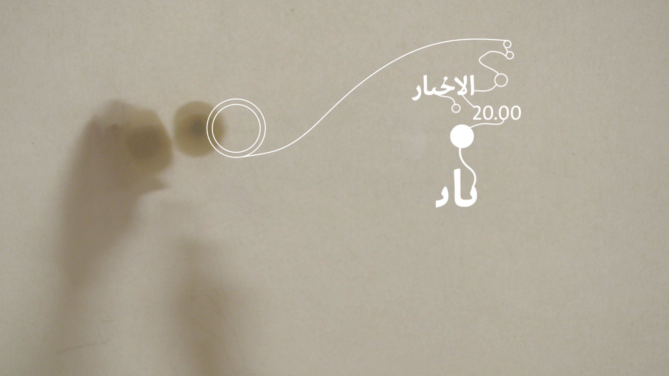
I focused on the social aspect of Ramadan, where family and friends gather around the table to break their fast. From that concept, the visuals focus on the table and the act of coming together, while the music is focused on the peace and harmony. Arabic Typography is used to convey the cultural meaning through form and motion.
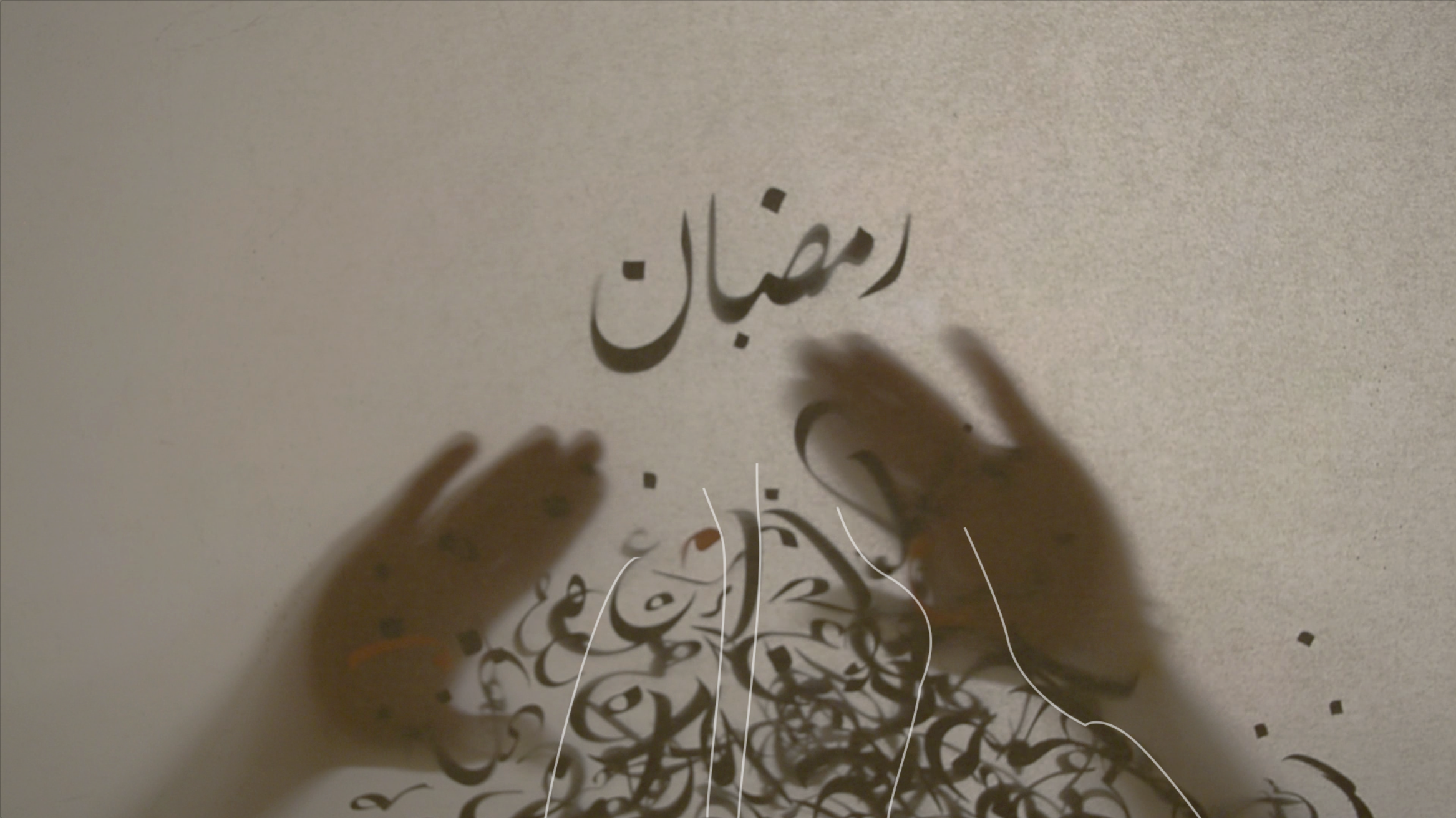
Commercial Break-In Ident
Commercial Break-Out Ident
TV Schedule Ident
LBC Channel Ramadan Promotion (A)

LBC Channel Ramadan Promotion (B)

–
RESEARCH
Competitive analysis and Interviews were done over 4 months. By comparing local, regional, and international TV graphics and TV branding. I also studied the application of Kinetic Typography (both Latin and Arabic) in different cases.
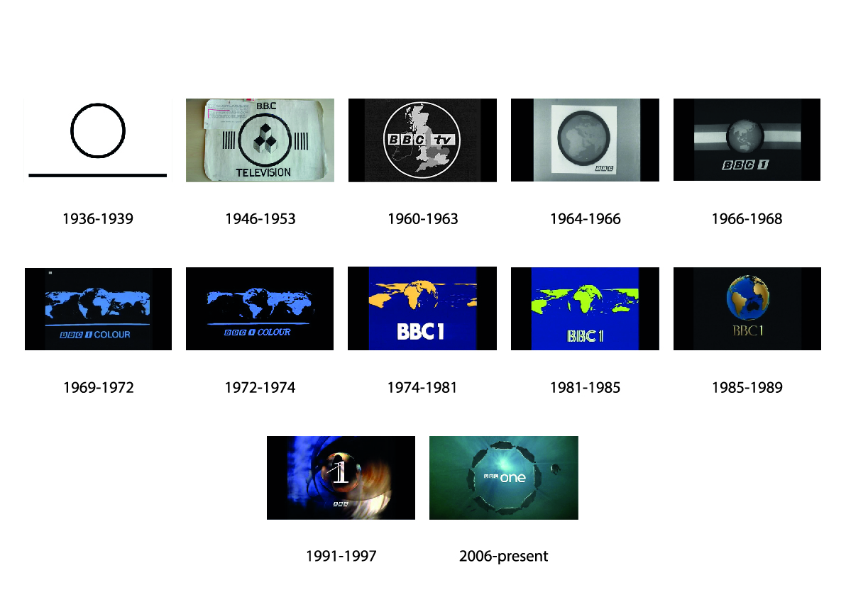
“The changing of a channel symbol is a crucial event and not one to be undertaken without more than usual thought and careful preparatory work” (Clifford Hatts, Head of Television Design Group, 18th July 1974).
History | Development of a channel’s logo (e.g. BBC)
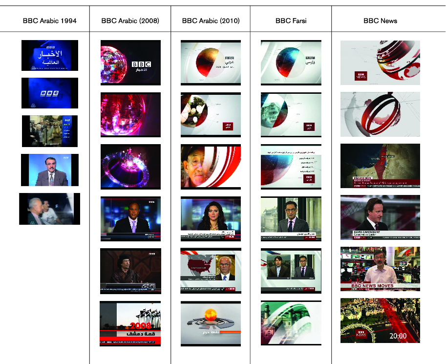
Western vs Arabic branding
Understanding the components of TV Branding, by comparing Western Channel Branding & Arabic Channel Branding for the same company.
Holiday Branding
A comprehensive comparison chart was developed by studying the visual language and traditions of some of the main holidays, which are Christmas, Easter, Ramadan, and Eid el Fitr. For each holiday, I looked at the food, clothes, decoration and activities associated with that holiday, and digital and print graphics as well. I broke down the dominant color palettes, typographic styles, and icons or shapes used. It was apparent that the digital and print media did not differ in terms of visual language. Thus, there is a clear set of identity markers for each holiday that is being used across all disciplines.
–
RESEARCH TAKEAWAYS
Availability
Limited availability of Arabic screen fonts and compatible animation softwares leads to similar graphics and identity across TV channels.
Legibility
Technological limitations led to refinements on smaller size fonts in order to look more geometric and legible on screen.
Bilingual Channels
Timing in TV, which is usually tested by trial-and-error, restricts the number of lines of text on screen to 3, making bilingual graphics harder to read.
Cultural
Cultural and religious sensibilities can limit the visuals and audio during Ramadan.
